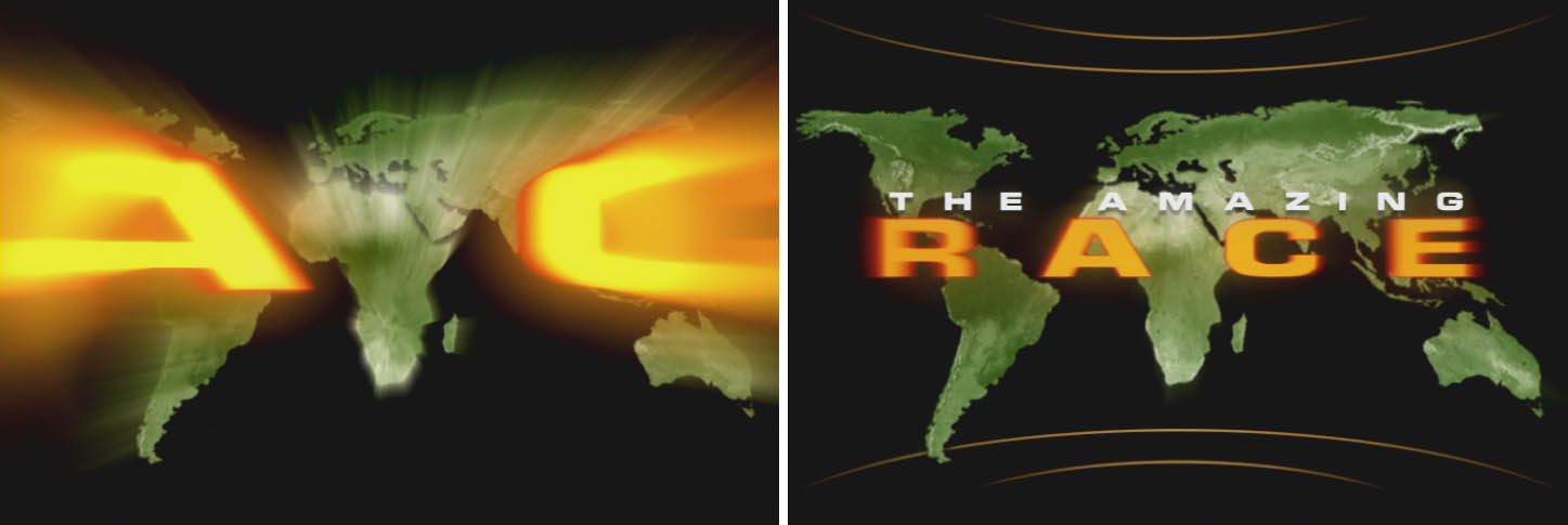
the amazing race
Main Title Design & Graphics Package (season 1)
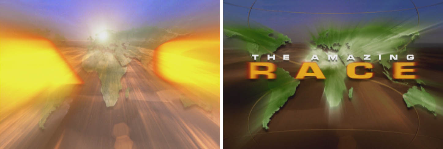
The main logo uses an earthy-explorer color theme more akin to a National Geographic magazine.
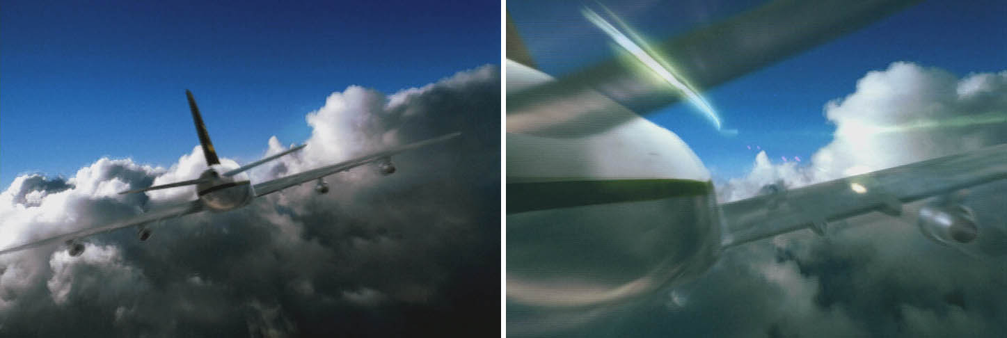
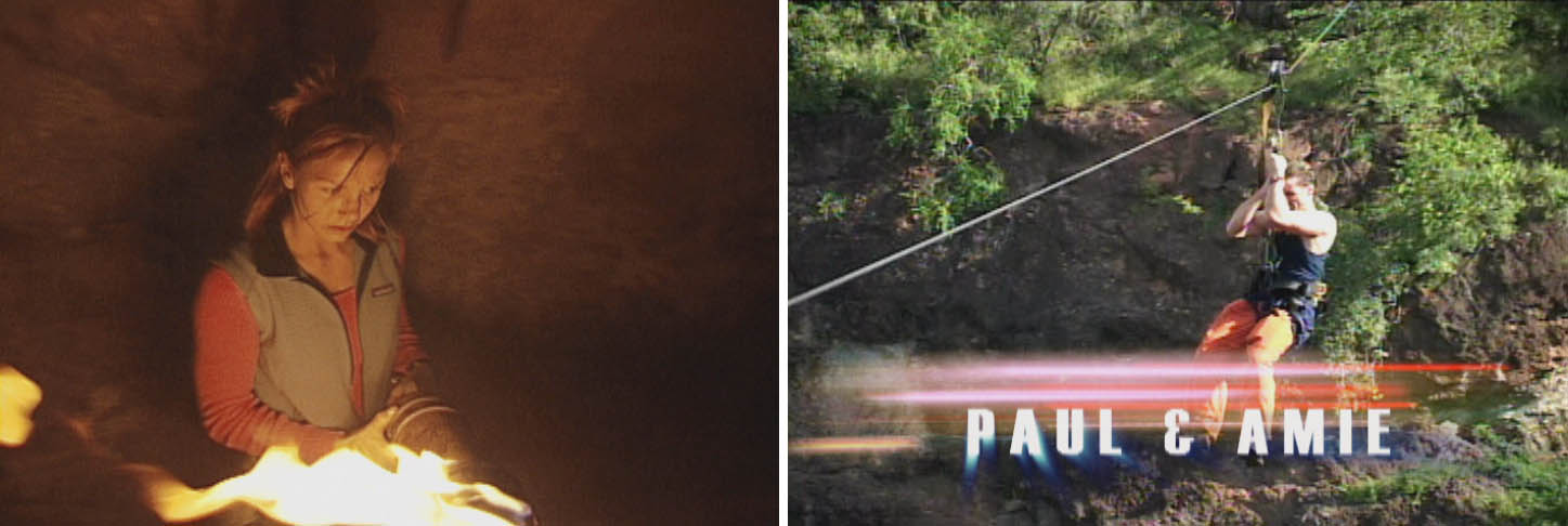
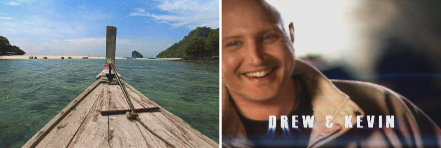
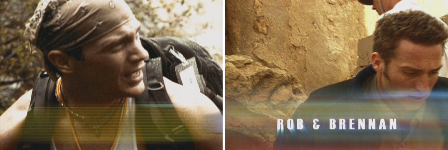
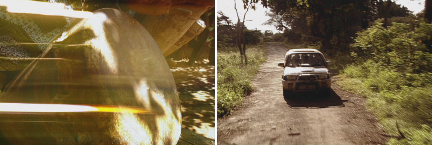
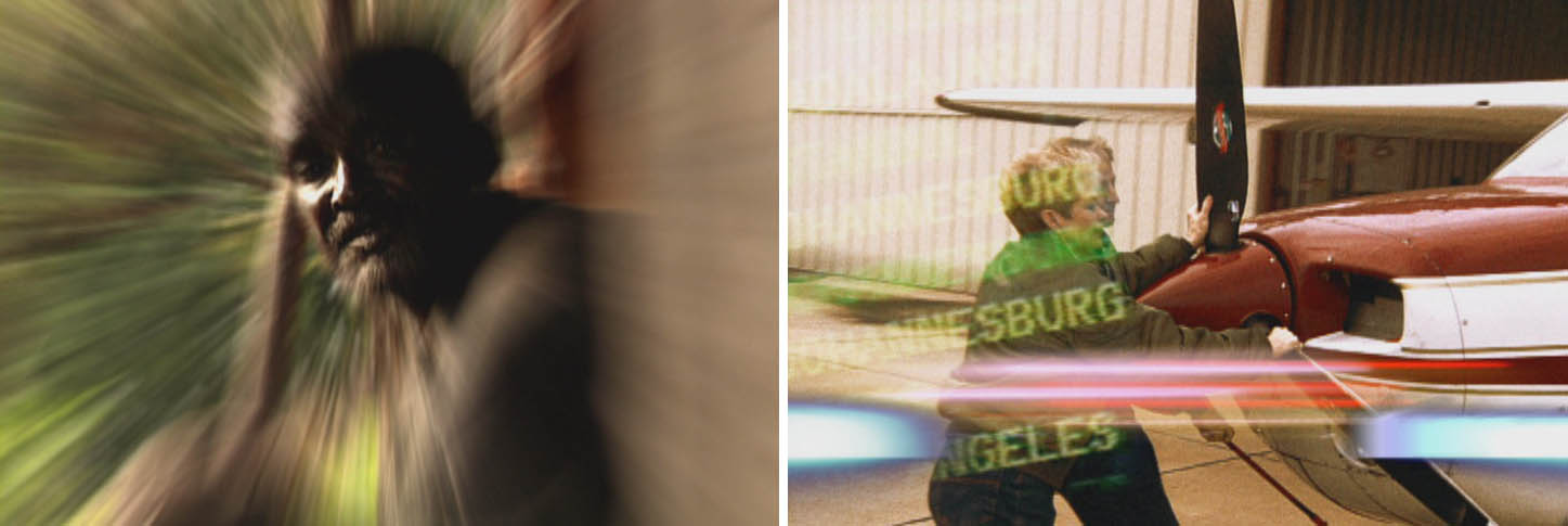
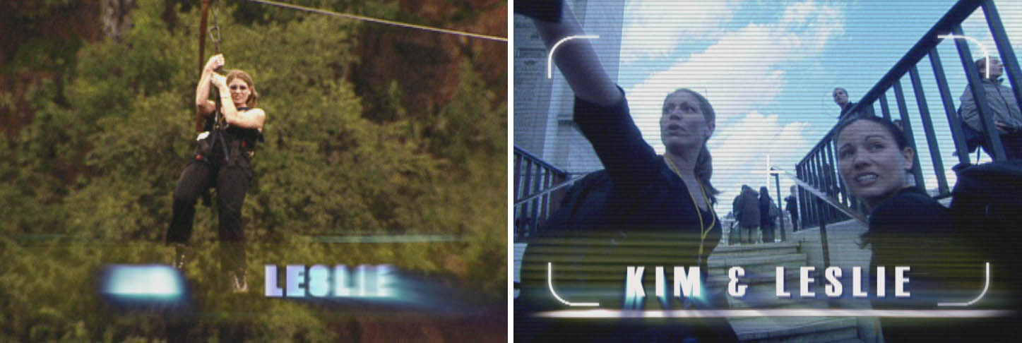
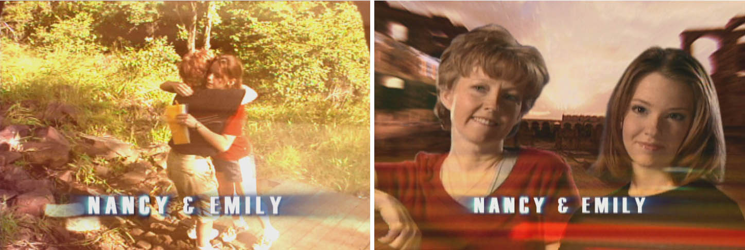
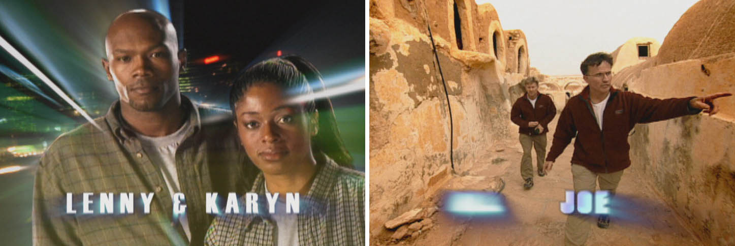
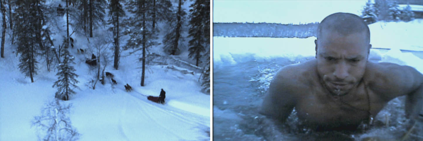
Because the Adrenalin-pumping opening could not reveal the cast at any specific location, they were digitally removed from video footage and re-inserted over other plates to throw the viewer off. The location footage was captured using multiple formats with varying degrees of quality. An overall film look was applied and then treated with multiple overlays of color and fast moving elements to quicken the pace even more. The impossible CGI jet flyby at the start of the opening was achieved by tracking real clouds (shot at 400 mph) and inserting a CGI jet.with multiple light and shadow passes. We designed every graphic that is used inside the show and the actual race (still used today).